Design Matters: Creating a Welcoming Classroom Environment
This blog is part of our Design Matters series:
- How to Design Classrooms that Transform Learning
- Creating a Welcoming Classroom Environment
- Strategically Planning Classroom Flow
- Develop a Critical Eye for How Learning Spaces Support Learning
In this series, we continue to explore the importance of classroom design. This blog is inspired by my interest in shopping and my love of retail. Venturing out with a cup of coffee in hand, I leisurely strolled through a few of my favorite shops and it started me thinking about how businesses strategically plan their spaces.
Classroom Design: Lessons from Retail
Millions of dollars are poured into researching, designing, and developing retail spaces to ensure a positive customer experience. The design of a store’s floor space and the items’ placement within that store are analyzed countless times. That’s because the store layout helps influence a customer’s behavior and, when done right, is a crucial strategy to store a success.
Do you think we give the same care and consideration to classroom layout?
Just for fun, let’s treat our classroom like your favorite retail space.
Classroom Layout
The area a few feet from the entrance is known as the decompression zone. This space is designed to calm you as you enter the space. Shoppers want to enter stores that interest them and make them feel welcomed.
The classroom is no different. We want to welcome and invite students and help prepare them for the day ahead, encouraging them to focus and be open to learning. At the room entrance, the decompression zone should give them space to acclimate as they enter.
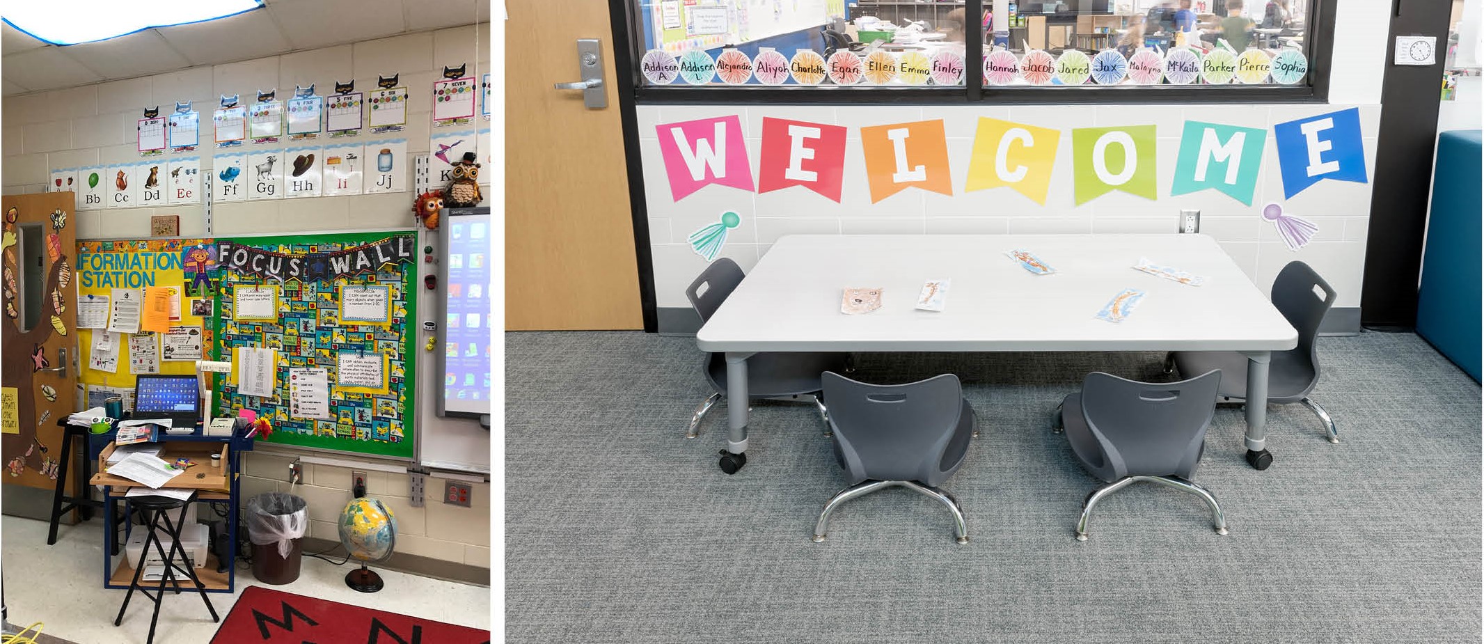
Which entrance feels more inviting to you?
Creating a Classroom Decompression Zone
Think about the message you send when students enter your classroom. What is the first thing they see and how does the space make them feel? If this first impression identifies your “brand,” what would it be? How would kids hashtag it? #youmatter #homeawayfromhome #ibelong #iaminspired #iamsafe
Use this checklist to help plan your decompression zone:
- As in retail, the decompression zones should be sparsely decorated
- Select posters or decorations that have soothing colors
- Use mobile furniture or a bookshelf to create an entrance
- See it from the student’s point of view
- Attract students into the room by featuring small displays of interest
- Have 1-2 motivational messages for inspiration.
When you walk through the door, how would you like to be greeted? Consider these Morning Meeting Greetings for your “shoppers.” If you’re short on time, a warm smile and a sideways hug while telling them you’re happy to see them is really all they need.
What to Avoid In Your Classroom layout Design
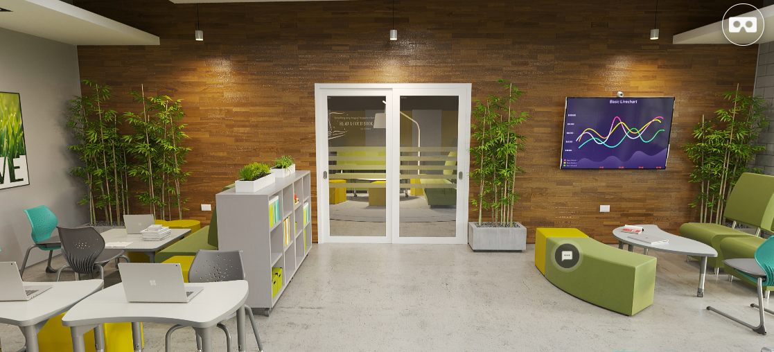
Unappealing sightlines: Literally put yourself in their seat. What do you see?
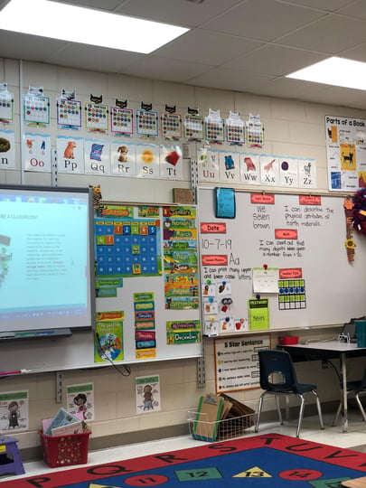
Too much color: This overstimulates students, reducing their ability to focus.
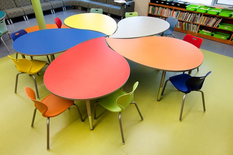
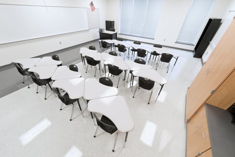
Monotony: Avoid the other extreme of too little attention to color and décor. A sterile environment feels institutional. All humans feel connected to the environment when it makes us feel safe and secure.
More Classroom Environment Ideas
In the next blog in this series, we look at the flow of the classroom. Just like a retail space, we need to evaluate our spaces on effectiveness and efficiency.
For more helpful information on transforming your learning environment to ensure student success, check out these useful resources!
Recent Posts
Hi, I'm Mateo.
I’m seventeen, and people usually notice two things about me right away:
When we listen to the smallest voices, we often find the biggest ideas.
Let’s meet the children of...
Walk into any classroom and you can feel it immediately — the energy, the movement, the noise, the...
